Flyers are probably the most versatile of all advertising tools. With their personal and tactile nature (you personally give the flyer) and wide reach (recipients can pass it along), they can be the most effective and efficient for promoting your business.
For the most part, flyer advertising is easy. You just create a design, print it with your trusted printing service provider, and hand it out to potential customers during events, trade shows, or every day in front of your establishment. As a marketer, I like getting flyers and checking them out. But after reviewing hundreds, if not thousands of flyers since college, I’ve noticed some common mistakes that happen all too often.
If you are reading this article, chances are, you are making some of these flyer advertising mistakes and you don’t want them to happen again. Redesigning your flyers and overhauling your process is easy if you know where to look.
Here are some flyer advertising mistakes you are probably doing that you need to improve:
You write features and services in bullet points.
A lot of flyers I have come across include a single sentence that acts as a headline followed by bullet points listing the features of their products or the services that they offer. Sure, it does the job of presenting your business. But that’s it.
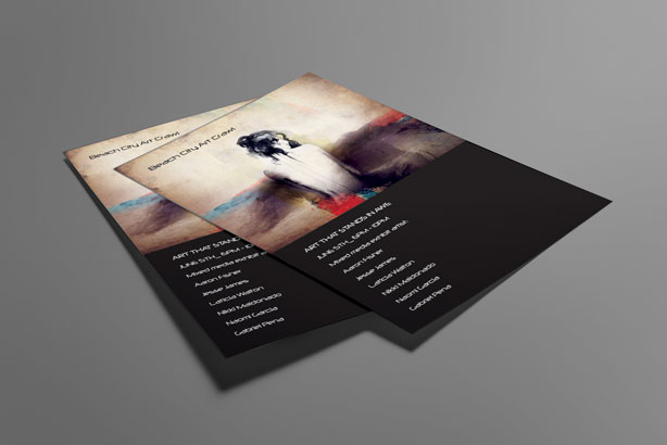
Thing is, if customers read how you provide affordable water purifying services or how you have the best dry cleaning process in your city, they’ll probably say, “Neat” and move on. But if you want them to actually want to learn more, try a different approach.
How about saying how much time and effort they would save if they use your product? How about telling them what they can do with the time they saved? Telling your customers to use the time they save using your product, to spend more time with their loved ones, resonates more than listing product features.
You write a lackluster headline.
Forming a headline for any article, flyers included, is easy. But forming a headline that will resonate well with your reader can be hard.
A pretty common problem for flyer headlines is the lackluster headline and sometimes, a lack of a headline. Some business owners think that merely putting a brand or business name is enough to sell a product. This shouldn’t be the case.
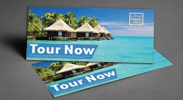
The headline is the first thing that your recipient will see. A good technique I use to write my headlines is to make them curious. Ask your prospective customer if they are experiencing a specific problem. Or in this article’s case, I tell them that they are doing something wrong and I can make it right. It did catch your attention, yes?
You have little connection between buyer persona and flyer copy.
An effective flyer advertising campaign relies on demographics and psychographics of your target market. Doing a one-time flyer distribution blast and seeing what sticks, is inefficient, and would cost you more money in the long run. It would be better if you analyze each area’s demographics and start distributing there.
Aside from flyer distribution, you should take into consideration your buyer persona when creating your design and writing the text. Knowing what are relevant words or graphics for your target market gives a higher chance of converting them into customers. Speaking of which…
You use low quality photos and poor design.
As a graphic designer, one of my pet peeves is to see low quality resolution on business flyers. It is an unforgivable sin in graphic design to use clip art or even stock photos that still include watermarks.
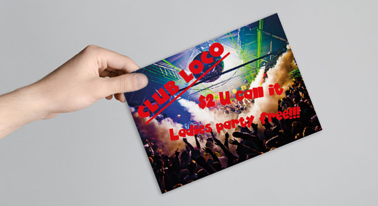
I know it’s cheaper to just do it yourself, so be sure to ask for feedback on your design before going full blast. Also, it doesn’t hurt to hire a good graphic designer, especially if you are investing in a flyer advertising campaign.
Aside from the photos, be sure of the quality of the paper used by your flyer printing company. The quality of the material you’ve chosen will reflect on your brand as a whole.
You end your flyer advertising without a call-to-action.
As with pretty much any advertising campaign, you should never end without telling your recipient what they should do. Flyers usually end by giving the business contact number for more information. Sadly, this doesn’t work all the time.
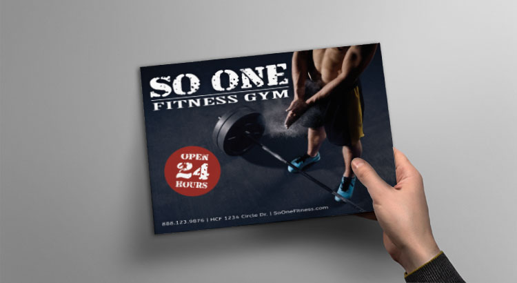
What you should do is motivate your recipient. For instance, you can create a promotion centered on your flyers. Tell your audience how they can get a discount when they buy your product before a specific date. You can also ask them to present the flyer on their next purchase to get another discount. If you want to increase your customer base, ask them to pass the flyer to a friend for another discount.
ARTICLE By: ND Flyers

206-391-5682
i2i@i2idirectmarketing.com
www.i2idirectmarketing.com
“…all deliveries GPS tracked…”


